
Purpose
This SOP describes how to create a new design file in Figma, draw and style a rectangle with custom colors and rounded corners, and add text with adjusted font sizing.
Scope
This procedure is intended for designers or users creating UI elements in Figma. Follow this SOP when you need to create styled buttons or rectangular components with text labels.
Prerequisites
Figma account (free or paid)
Logged in to Figma
Access to Figma web application or desktop app
Procedure
- Step 1 of 11
Create a new design file
Click the New Design file button
Click the New Design file button to create a blank canvas for your design.
- Step 2 of 11
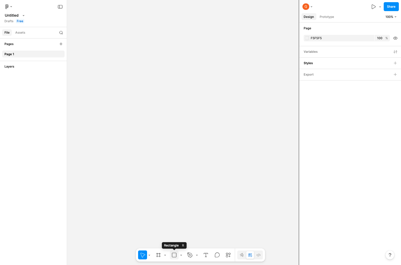
Select the Rectangle tool
Click the Rectangle tool in the toolbar
Click the Rectangle tool in the bottom toolbar. You can also use the keyboard shortcut R to activate it quickly.
- Step 3 of 11
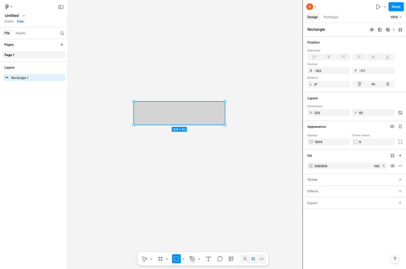
Draw a rectangle on the canvas
Click and drag on the canvas to create a rectangle
Click on the canvas and drag to draw a rectangle. The default fill color will be a light gray.
- Step 4 of 11
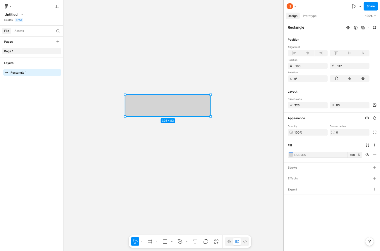
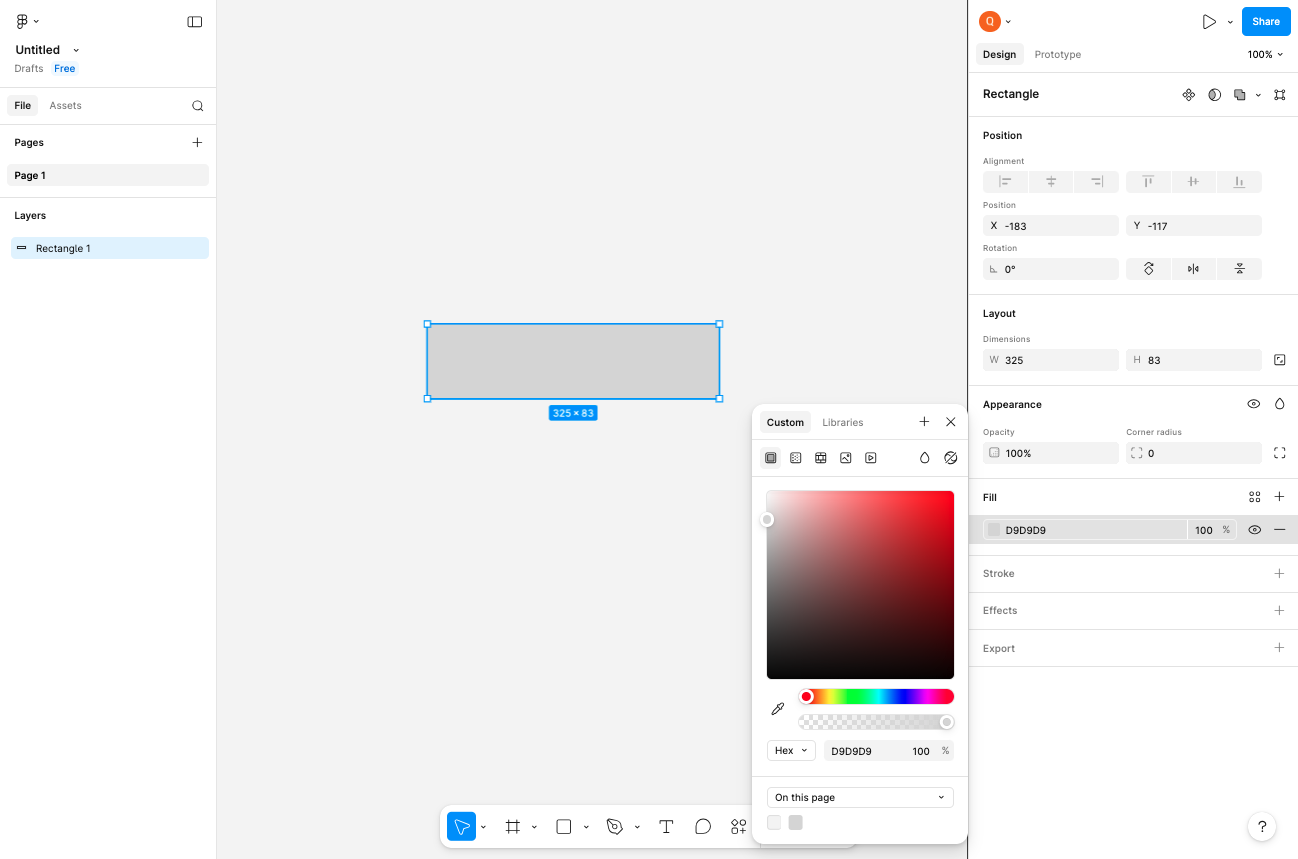
Open the fill color picker
Click the fill color swatch in the right panel
With the rectangle selected, locate the Fill section in the right-side properties panel. Click on the color swatch (showing hex value D9D9D9) to open the color picker.
- Step 5 of 11
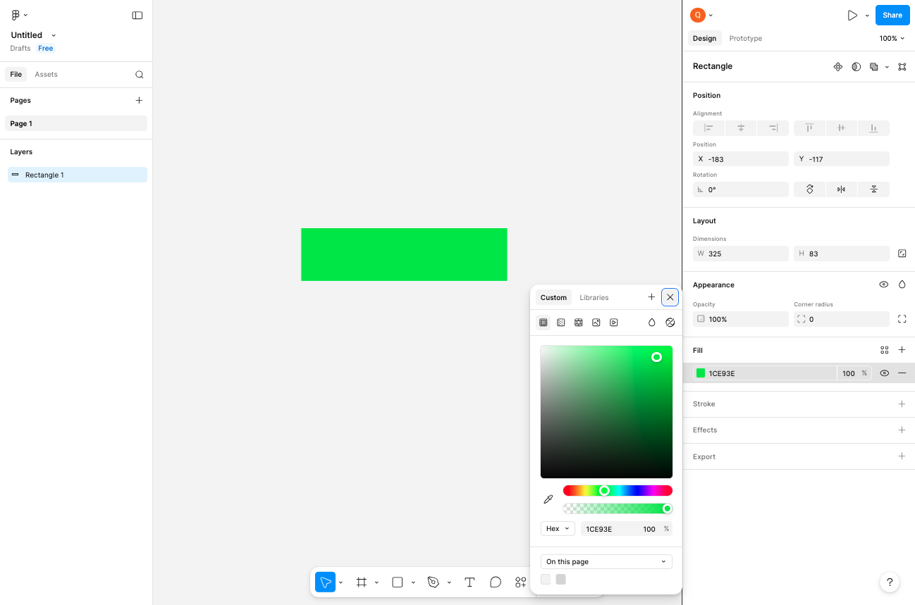
Select a custom color
Click on the hue slider to choose a color
In the color picker, click on the hue gradient bar at the bottom to select your desired color (such as green). Then adjust the saturation and brightness by clicking in the main color square.
- Step 6 of 11
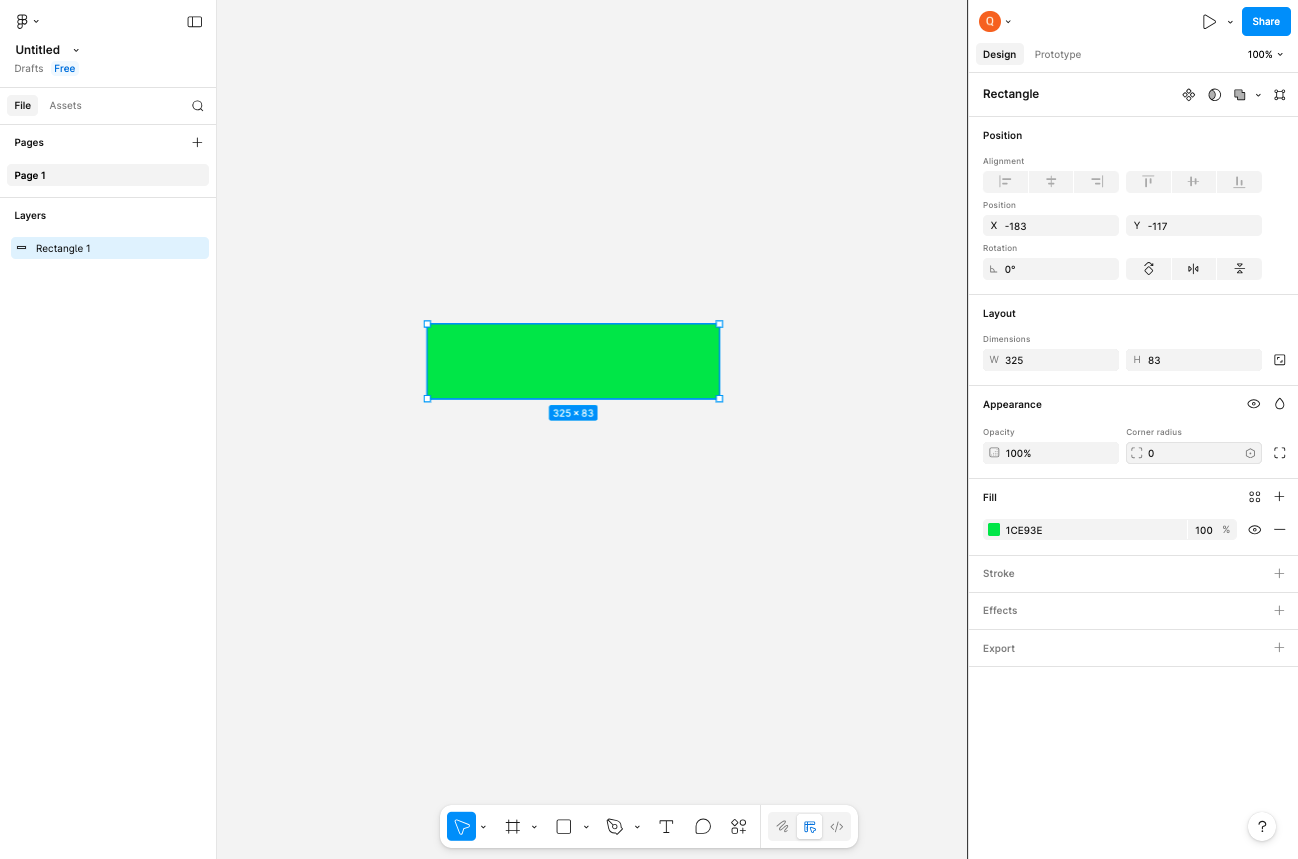
Close the color picker
Click the Close button or click outside the picker
Click the Close button or click anywhere outside the color picker to apply the selected color to your rectangle.
- Step 7 of 11
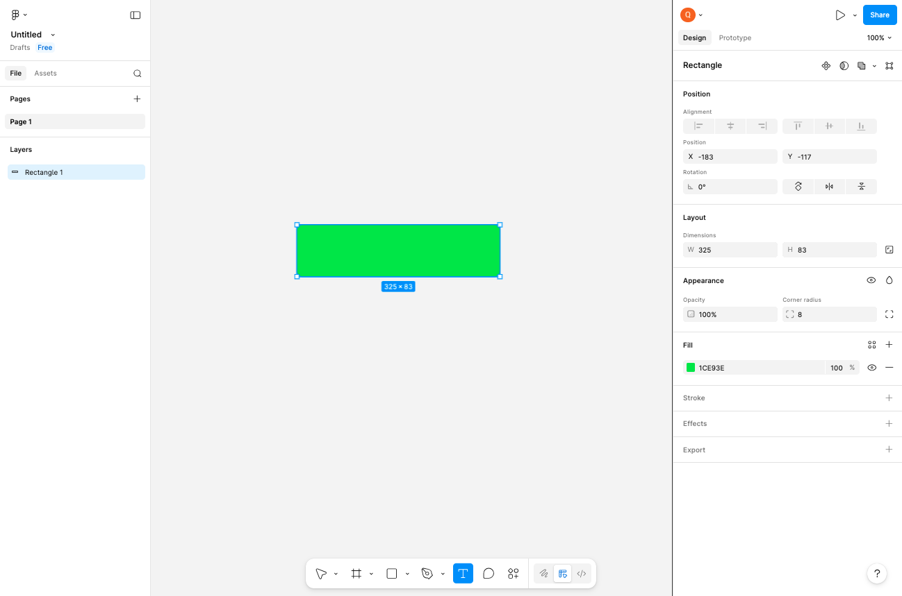
Add rounded corners
Set the corner radius value
Locate the Corner radius field in the right panel under the Layout section. Click on the input field and enter 8 to create rounded corners on your rectangle.
- Step 8 of 11
Select the Text tool
Click the Text tool in the toolbar
Click the Text tool in the bottom toolbar. You can also press T as a keyboard shortcut.

- Step 9 of 11
Add text to the design
Click on the canvas to place a text element
Click on the canvas (preferably on or near your rectangle) to place a new text element. Type your desired text content such as submit or any label text you need.
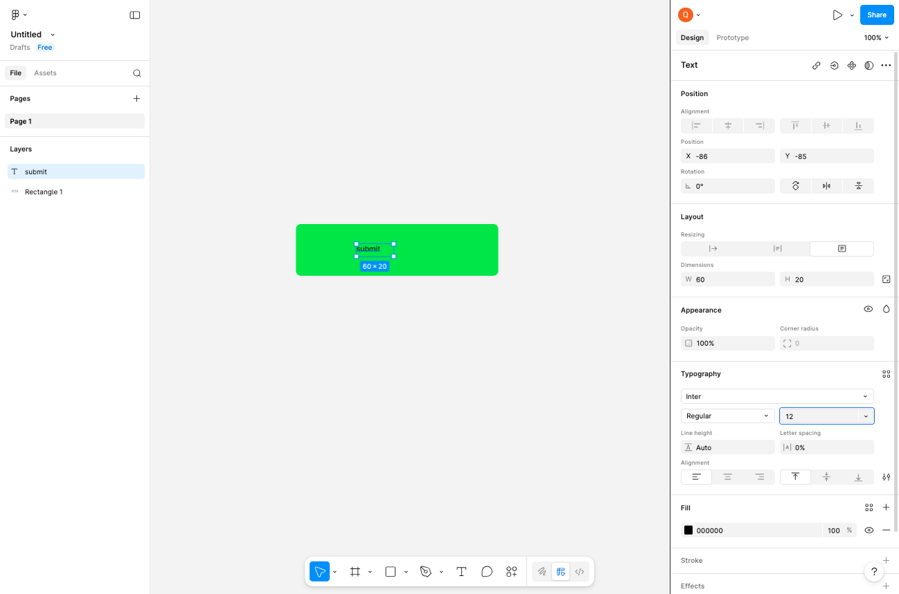
- Step 10 of 11
Adjust the font size
Open the font size dropdown
With the text selected, locate the Typography section in the right panel. Click on the font size field (showing 12 px by default) to open the font size dropdown.
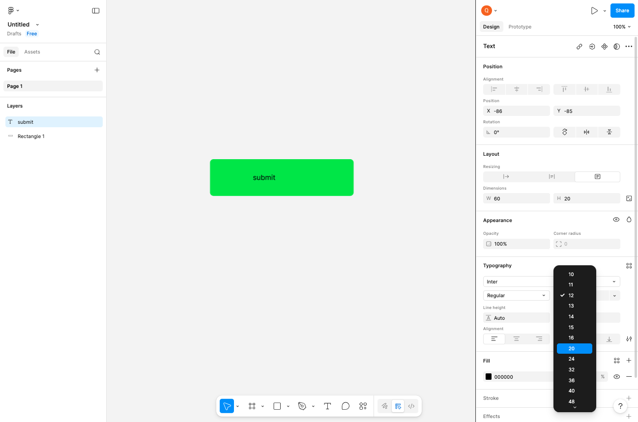
- Step 11 of 11
Set the desired font size
Select a larger font size
From the font size dropdown, select 24 px or any desired size. The text will immediately resize on the canvas.
Verification
Confirm the procedure completed successfully by verifying:
A new design file was created and is open in the editor
A rectangle is visible on the canvas with the custom color applied
The rectangle has rounded corners (corner radius of 8)
Text has been added and is displayed at the larger font size (24px)
Both layers (Rectangle and Text) are listed in the Layers panel on the left
Conclusion
You have successfully created a styled button-like component in Figma with a colored rectangle, rounded corners, and properly sized text label.